
About Me
Seeing a mess. Enjoying the adventure. Telling the story.
I'm a certified data & BI analyst and MBA graduate who transforms messy data into clear actionable insights.
I help business make data-driven decisions with tools like SQL, Power BI, Python, Tableau, and Excel. Equipped with an MBA, I focus not just on what the data says, but how actionable its insights are.
What I deliver:
Clean pipelines - Transforming raw data into structured, analysis-ready formats
Business analysis- Asking sharp questions, modeling outcomes, A/B testing, and testing assumptions
Impactful storytelling- Designing dashboards and reports that reduce reporting time and drive action
Skills


Excel | SQL | Tableau | PowerBI | Python | R
Data Gathering & Cleaning
Data Analysis, Modelling & Interpretation
Data Visualization & Storytelling
SQL & Database Management
Business Intelligence & Reporting Automation
A/B Testing


Featured Projects

MS EXCEL | DATA TRANSFORMATION & REPORTING
Excel empowers my data analysis and BI workflows, enabling data cleaning, analysis, and interactive reporting with dynamic dashboards.

Power BI | Ireland’s FDI & Migration Trends (2014–2024)
A 10-Year Analysis of Investment, Jobs & Population Dynamics

Power BI | NHS Hospital Admissions Dashboard
Developed an interactive dashboard to analyze 12.8M admissions, emergency cases, and patient demographics to support hospital resource planning.

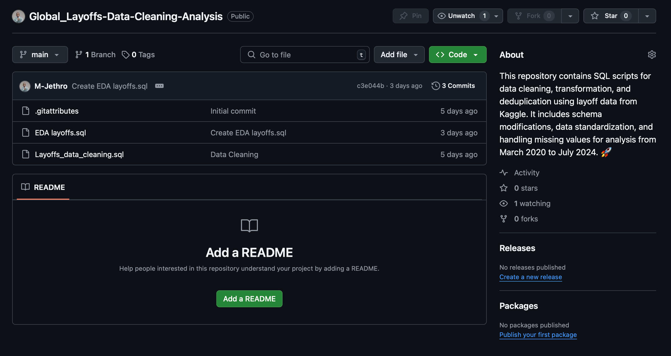
SQL | Global Layoffs Analysis (2020-2025)
Processed and analyzed large-scale layoff data using SQL, refining datasets to reveal workforce trends from 2020-2025. Provided structured insights into the industries and companies most affected over time.
TABLEAU | HR ANALYTICS DASHBOARD
Streamlined HR reporting with a dynamic Tableau dashboard that transforms raw data into actionable insights.

Certifications
Google Data Analytics Certificate
Google Business Intelligence Certificate
PowerBI Data Analyst
MS EXCEL | DATA TRANSFORMATION & REPORTING
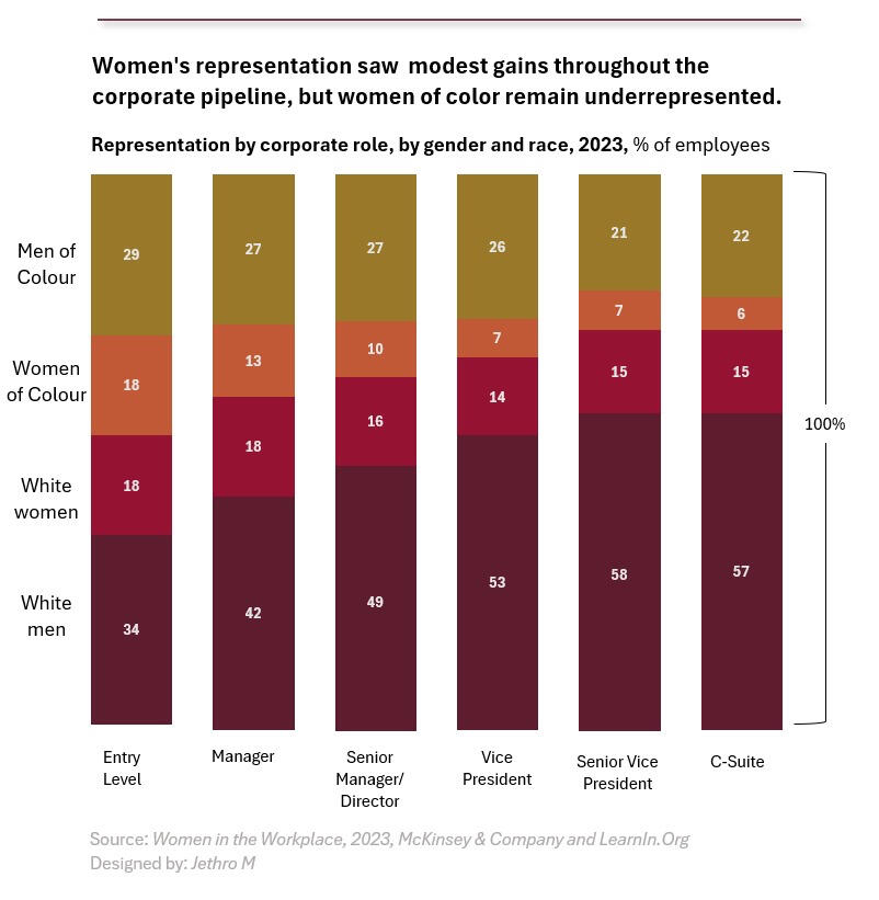
This chart showcases my ability to analyze and visualize workforce data using Excel, turning complex numbers into clear, actionable insights. Using Power Query and Pivot Charts, I structured the data to highlight representation trends across corporate roles. My goal is to make data easy to understand, helping businesses make informed, data-driven decisions.
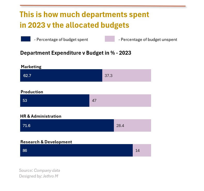
This visualization reflects my ability to analyze financial data using Excel, breaking down departmental budget utilization in a clear and digestible format. By leveraging Pivot Tables, Power Query, and advanced charting, I transformed raw budget data into an easy-to-read comparison of spending versus allocation. This type of analysis helps organizations track financial efficiency, identify cost-saving opportunities, and make informed budget decisions.
This visualization demonstrates my ability to analyze industry trends using Excel, tracking mergers and acquisitions (M&A) activity in the tech sector before and after COVID-19. By leveraging Pivot Charts, data aggregation, and trend analysis, I identified shifts in corporate strategies over time. This kind of insight helps businesses and investors understand market dynamics, investment patterns, and strategic decision-making in a rapidly evolving industry.
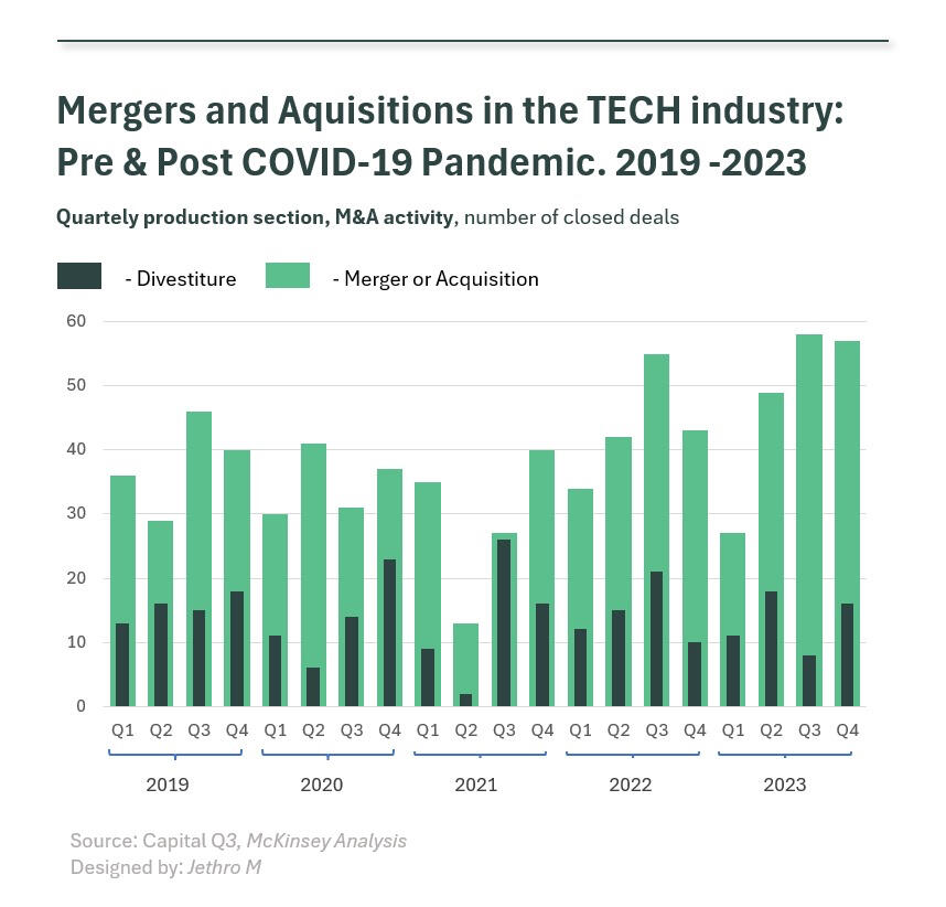
TABLEAU | HR ANALYTICS DASHBOARD
OverviewThis interactive Human Resources Dashboard provides a comprehensive real-time view of key employee metrics, enabling HR managers to track trends, identify insights, and make data-driven decisions.With a dynamic, filterable interface, users can explore various aspects of employee demographics, recruitment, salary distributions, and department performance all in one centralized view.
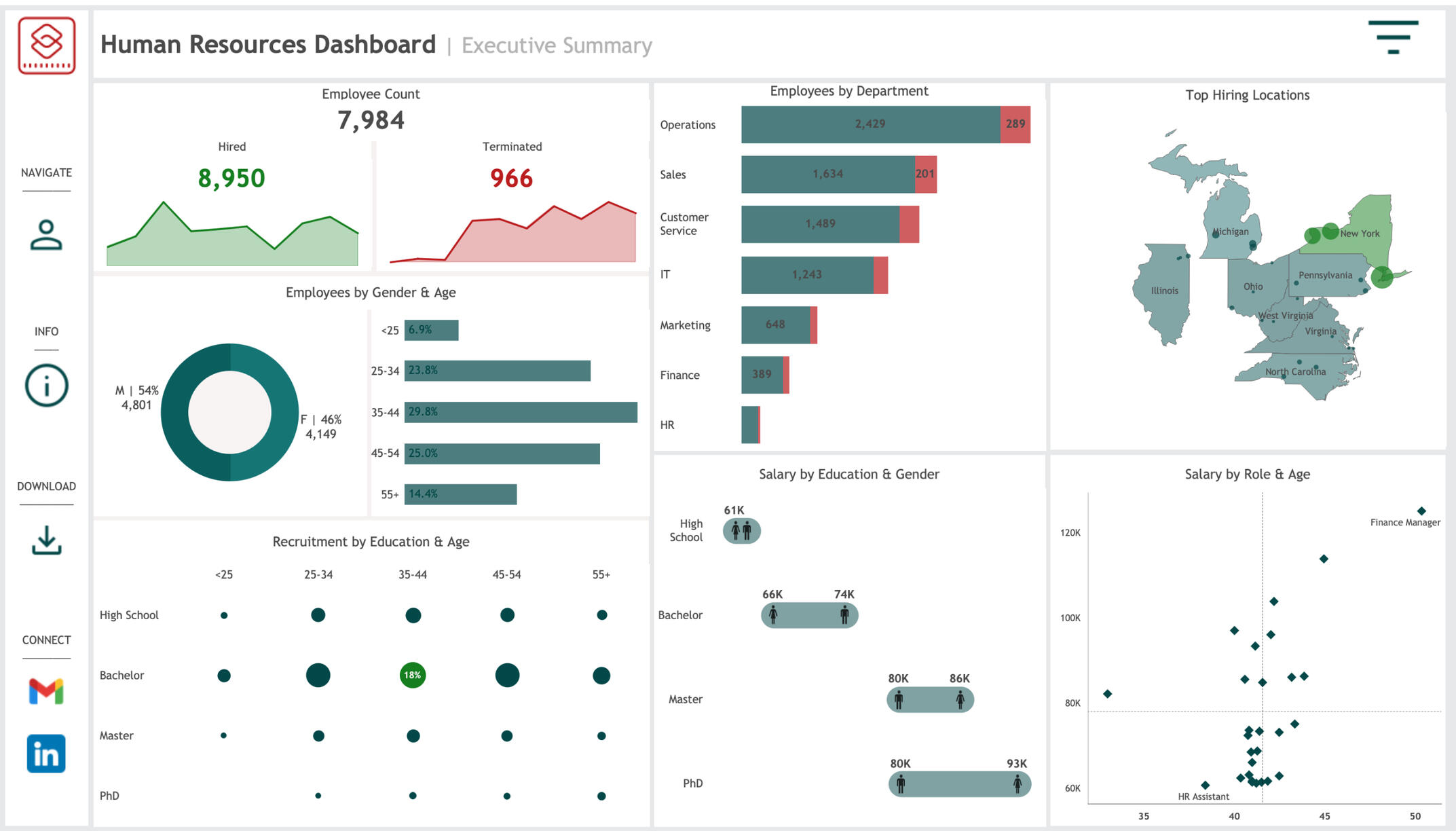
This dashboard captures key HR KPIs such as:Employee Count & Turnover – Tracks total employees, hires, and terminations to monitor workforce trends.
Employees by Gender & Age – Offers insights into gender representation across different age groups.
Departmental Breakdown – Displays the number of employees per department, with a visual representation of new hires vs. terminations.
Top Hiring Locations – Highlights geographic hiring hotspots, crucial for expanding recruitment strategies.
Recruitment by Education & Age – Analyzes the educational background of recruits across different age groups.
Salary Insights – Compares salaries by education level, gender, and role, helping identify pay disparities or trends.
Dynamic & Interactive FeaturesThe dashboard is fully filterable and dynamic, allowing users to drill down into specific metrics based on department, age group, gender, education, and geography. As showcased in the loop video above, users can interactively adjust parameters to explore workforce trends in greater depth, making it an adaptable tool for HR teams, executives, and recruiters.Key Takeaways1. Employee Growth & Retention: With 8,950 hires vs. 966 terminations, workforce growth remains strong.
2. Gender Representation: The workforce is 54% male and 46% female, with balanced representation across age groups.
3. Salary Trends: Gender pay gaps are visible at bachelor and master’s levels, highlighting areas for compensation review.
4. Hiring Hotspots: Locations such as New York and Pennsylvania show high recruitment activity, guiding regional hiring strategies.
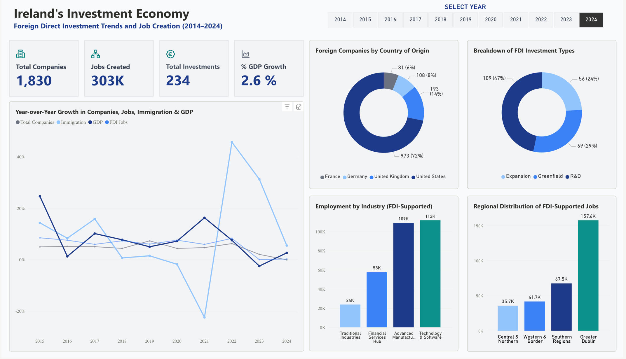
Power BI | Ireland’s FDI & Migration Trends (2014–2024)
The analysis addresses a fundamental question: How have migration patterns and foreign investment shaped Ireland's economic landscape from 2014-2024?
I structured this into two complementary dashboards:Ireland's Demographic Transformation - Migration flows, population growth drivers, and demographic composition
Ireland's Investment Economy - FDI patterns, employment creation, and economic dependencies
Data Sources and AcquisitionPopulation and Migration Data:
Source: Central Statistics Office (CSO) Ireland
Coverage: Annual population estimates, immigration/emigration flows, natural increase
Time period: 2014-2024
Format: Multiple CSV files with inconsistent structuresForeign Direct Investment Data:
Source: IDA Ireland annual reports (2014-2024)
Coverage: Company counts, employment figures, investment approvals by origin country
Format: PDF reports requiring manual extraction and consolidationData Processing Pipeline
Stage 1: SQL Data Cleaning
The SQL processing addressed several data quality issues:
Inconsistent year formatting (text vs numeric)
Varying terminology across annual reports
Missing values and formatting inconsistencies
Quarterly data requiring annual aggregationStage 2: Power Query Transformation
Combined multiple annual datasets into unified tables
Created standardized industry categorizations
Implemented data validation rules
Built automated refresh processes for new data integrationStage 3: DAX Modeling
Key measures included dynamic calculations responding to user filters:
Visualization Design Strategy
The dashboard design prioritized executive-level insights over technical complexity:
Color Strategy: Monochromatic blue palette for professional cohesion, with strategic orange accents for key insights.
Layout Hierarchy: KPIs positioned prominently, supporting visuals arranged to guide analytical flow from overview to detailed patterns.
Interactivity: Year-based filtering allowing users to explore temporal patterns while maintaining consistent comparative context.
Key Findings:
Demographics:
Migration now drives Ireland's population growth more than births
2022 saw massive immigration surge post-COVID
87% of migrants are working age (15-64)Investment Economy:
73% of FDI companies are US-owned (concentration risk)
Technology sector employs 112K people (largest FDI employer)
Dublin captures 52% of all FDI jobs (regional imbalance)
47% of new investments target R&D activitiesStrategic Insights:
Ireland successfully transformed from emigration to immigration nation
Heavy US dependency creates economic vulnerability
Regional concentration limits balanced national development
Ireland positioned as Europe's innovation hub, not just low-cost centerEconomic Cycles:
Immigration patterns closely track economic performance
Post-Brexit positioning as English-speaking EU gateway
Strong recovery resilience through global disruptionsThese insights reveal Ireland's evolution into a migration-driven, US-dependent, Dublin-concentrated economy with both significant opportunities and strategic risks.
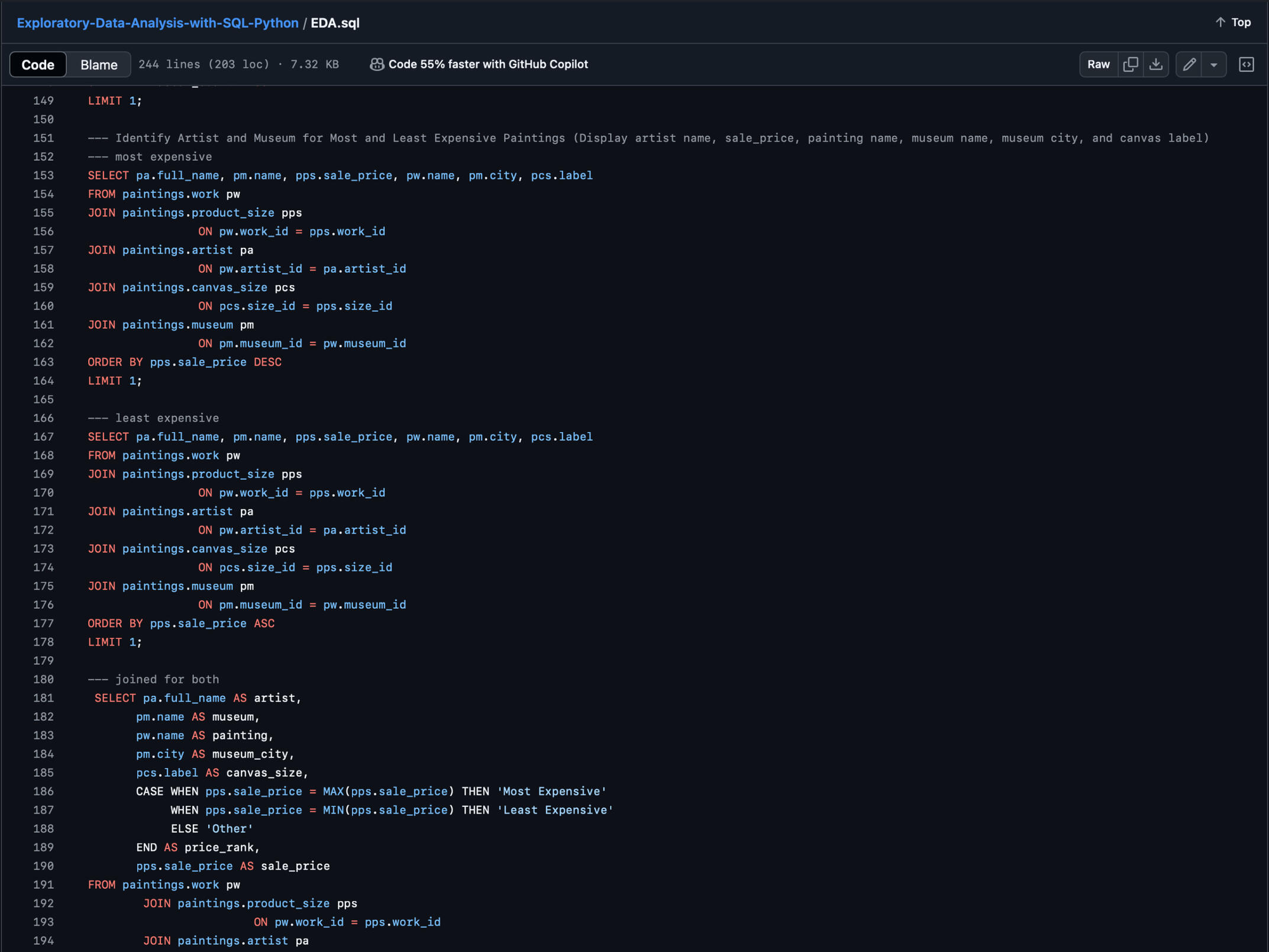
SQL | Global Layoffs Analysis (2020-2025)
This project aims to clean, transform, and analyze global layoff data from March 2020 to July 2024 using SQL, ensuring data accuracy and extracting meaningful insights.
It showcases my proficiency in SQL-based data cleaning, ETL processes, exploratory data analysis (EDA), and business intelligence applications. By structuring and analyzing workforce trends, this project demonstrates my ability to turn raw data into actionable insights for strategic decision-making.
Data Cleaning & PreprocessingThe first step in this project involved cleaning and preparing the dataset for analysis using SQL. It focused on:1. Standardizing Data Formats – Ensuring consistency in date formats, company names, and categorical values.
2. Handling Missing Values – Applying methods such as imputation and removing records with insufficient data.
3. Deduplication – Identifying and eliminating duplicate records to maintain data accuracy.
4. Data Integrity Checks – Filtering out inconsistencies and ensuring fields align with expected data types.
5. Schema Optimization – Renaming and restructuring columns for better readability and analysis.
This process resulted in a clean, structured dataset, enabling reliable and insightful analysis of global layoff trends.
With a refined dataset, exploratory data analysis was conducted focusing on:1. Industry Trends – Identifying which sectors experienced the highest layoffs.
2. Geographic Distribution – Analyzing layoff frequency across different regions.
3. Company-Specific Impact – Aggregating layoffs at the company level to detect major contributors.
4. Time-Series Analysis – Examining how layoffs evolved from March 2020 to July 2024.
5. Key Summaries – Computing key metrics such as total layoffs, average layoffs per company, and annual trends.
SQL & PYTHON | The Complete Toolkit
OverviewThis project is a comprehensive SQL toolkit designed to showcase advanced database management and data wrangling techniques for relational databases. It contains diverse SQL queries and scripts that cover table creation, data manipulation, joins, triggers, window functions, and deduplication strategies, demonstrating my ability to transform raw data into structured, insightful, and actionable datasets.
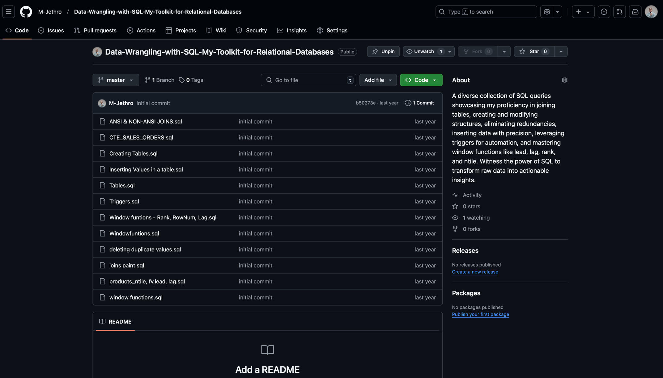
Database Design & Data Modeling – Creating and managing relational database schemas, defining table structures, and ensuring data integrity for optimized querying.
SQL for Data Extraction & Transformation (ETL) – Writing efficient SQL queries for data wrangling, including joins, CTEs, subqueries, and case statements to structure raw data for analysis.
Advanced Querying & Window Functions – Leveraging RANK, ROW_NUMBER, LAG, LEAD, and NTILE to perform analytical calculations and time-series evaluations.
Data Cleaning & Deduplication – Using SQL and Python (Pandas, NumPy) to remove duplicates, handle missing values, normalize data formats, and ensure high-quality datasets.
Automation & Workflow Optimization – Implementing SQL triggers, stored procedures, and Python scripting for data pipeline automation and scheduled reporting.
Business Intelligence & Visualization – Preparing structured data for Power BI, Tableau, and Matplotlib/Seaborn, enabling data-driven decision-making through actionable insights.
I have a collection of SQL and Python projects on my GitHub, showcasing my expertise in data cleaning, transformation, analysis, and visualisation.These projects range from SQL-based data wrangling/cleaning, ETL workflows, and business intelligence reporting to Python-driven data analysis.Each repository highlights my ability to handle real-world datasets, extract meaningful insights, and build scalable data solutions.You can explore my work and see how I apply data-driven problem-solving techniques by visiting my GitHub profile here. 🚀
Power BI | NHS Hospital Admissions Dashboard
OverviewThis interactive NHS Hospital Admitted Patient Care Activity Dashboard provides a data-driven view of hospital admissions, patient demographics, and healthcare service utilization across various specialties.Designed to help healthcare administrators, policymakers, and researchers, this dashboard enables a deep dive into patient episodes, waiting times, length of stay, and types of admissions for the year 2020-2021.
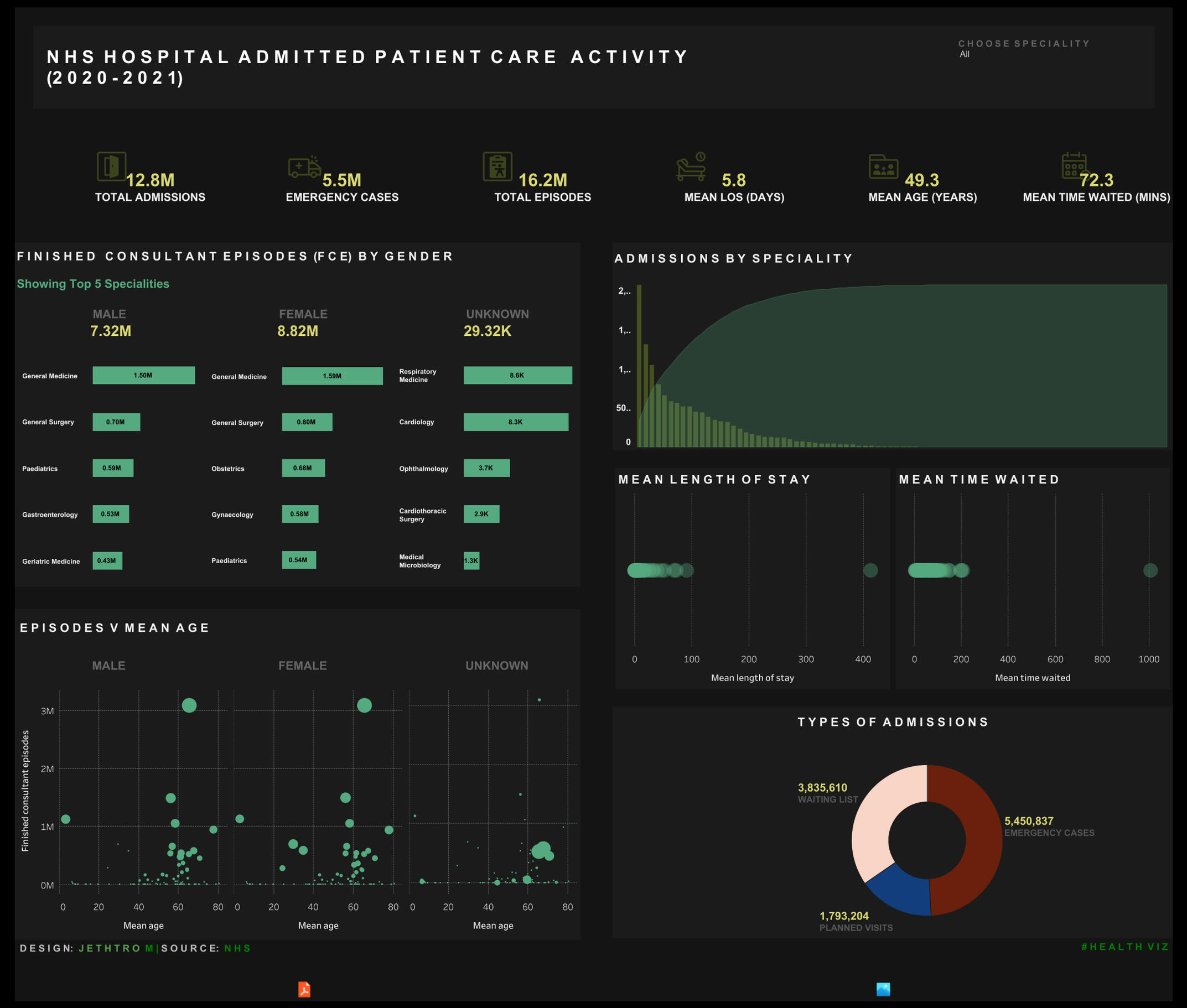
Key Metrics TrackedTotal Admissions: 12.8 million, indicating overall hospital inflow.
Emergency Cases: 5.5 million, reflecting critical care demand.
Total Finished Consultant Episodes (FCEs): 16.2 million, showing hospital case volume.
Mean Length of Stay (LOS): 5.8 days, providing insights into hospital bed utilization.
Mean Patient Age: 49.3 years, offering a demographic perspective on hospital admissions.
Mean Time Waited: 72.3 minutes, showing patient waiting times before receiving care.
This interactive dashboard allows users to filter and explore:Admissions by Specialty – Understand patient inflow across different medical specialties.
Gender-based FCE Analysis – Compare the volume of cases across male, female, and unknown gender categories.
Length of Stay & Waiting Times – Assess hospital efficiency and patient throughput.
Types of Admissions – Breakdown of cases into waiting list admissions, emergency cases, and planned visits.
Episodes vs. Mean Age – Visualize the relationship between patient age and consultant-led treatment episodes.
Key Takeaways:🔹 High emergency case volume (5.5M cases) indicates the need for optimized emergency response strategies.
🔹 Specialties such as General Medicine and Surgery have the highest finished consultant episodes, requiring more specialist workforce planning.
🔹 Waiting list admissions (3.8M) suggest potential delays in scheduled patient care services.
🔹 Patient demographics show a mean age of 49.3 years, implying a strong need for elderly-focused care strategies.